🎉 Vinner av Pris for sprĂ„k og formidling under Årets tidsskrift 2025 🎉

Feminismen tar form / Feminism Takes Form

Fra Ä vÊre en budbringer, har designeren blitt en avsender. For i dag kan ogsÄ formen bÊre et feministisk budskap. Design has always held the potential to communicate feminist values. Through the transition from a messenger to a creator of content, designers now have more possibility to shape these values than ever before.

1994 | Project: Pussy Galore – experimental typeface for FUSE 12: Propaganda (now in the Collection of the National Modern Art Museum, Paris) Fontshop International, Berlin, Winter 1994. Project team: Siñn Cook, Liz McQuiston, Teal Triggs. Photo: http://wdandru.tumblr.com/

Please scroll down for English

Det er lenge siden design gikk bort fra ideen om at det fantes ett universalt svar pĂ„ visuell kommunikasjon, og med den la ogsĂ„ de fleste designere igjen modernismens prinsipper. I grafisk design er de modernistiske formene definert av blant annet rutenettverk, grunnformer og -farger og groteske typesnittEn font er en del av et typesnitt. For eksempel er Helvetica Bold pkt 12 Ă©n font, mens Helvetica Light pkt 10 er en annen font – det overordnede Helvetica er et typesnitt. Helvetica er ogsĂ„ et typisk grotesk typesnitt – det vil si at man ikke har seriffer pĂ„ enden av bokstaver. Andre eksempler er Gill Sans, Futura og Univers. Disse var hĂžyt verdsatt av modernistene., men modernismen var ogsĂ„ tiden da flere regler og normer for grafisk design og typografi ble satt. Slik vi skal se senere er det i dag flere formgivere som betrakter de modernistiske elementene som bĂŠrere og representasjon av patriarkalske verdier.

Her i Norge hadde modernismen et stĂ„lgrep pĂ„ designfeltet langt utover 1970-Ă„rene. Noe vi kan se i blant annet det norske tidsskriftet Sirene – sist presentert i utstillingen Hold stenhĂ„rdt fast pĂ„ greia di: Norsk kunst og kvinnekamp (2013) – stilt ut pĂ„ Kunsthall Stavanger i 2014.

I boken In a Manner of Reading Design (2012) sier Helmut Draxler, tidligere kurator og direktÞr pÄ Kunstverein Munich, at ideen om design rundt tiden av Ulm-skolenUlm-skolen var en tysk skole for design og kunst, grunnlagt i 1953, og som viderefÞrte flere av Bauhaus sine modernistiske prinsipper. i 1950-Ärene skapte en separasjon mellom kunst og design. Hovedsakelig handlet denne separasjonen om at kunsten hentet sin egenverdi fra verket som autonom enhet, mens design skulle handle om sosialt ansvar: «Art was determined as subjective and design as objective, working to some extent with concrete problems, which are mathematically solvable.»

Denne midthundretalls overbevisningen om at designere skal vÊre ansvarsfulle vokste frem i sammenheng med ideen om at design kunne bidra til sosiale omforminger. Designeren var den objektive vokteren av budskapet, men hadde samtidig ansvar for Ä bidra til samfunnsendring. Her lÄ det ogsÄ en idé om det eksistert en korrekte type design, et universalt form-svar. Det kan nevnes at det i all hovedsak var hvite menn som kom opp med de korrekte svarene pÄ designspÞrsmÄlet.

KjÞnnspÞrsmÄlet

SpĂžrsmĂ„l om kjĂžnn har alltid fulgt grafisk design, blant annet fordi design er delaktig i konstruksjonen av kjĂžnnsroller. PĂ„ den mĂ„ten ligger det implisitt at feltet ogsĂ„ kan vĂŠre del av Ă„ bryte dem ned. Fordi design ofte ses pĂ„ som et serviceyrke, der designeren opptrer som den objektive formidleren – som nevnt en meget utdatert idĂ© - er det for mange vanskelig Ă„ forstĂ„ at designeren ogsĂ„ har sine egne budskap som integreres i designprosessen og produktet.

DisiplinÊrt kan designeren pÄ mange mÄter ses Ä gÄ fra det objektive til det subjektive allerede i 1960-Ärene. Utover 1900-tallet tar designeren selv stÞrre styring over hvordan budskapet kommuniseres, frem til formen pÄ 2000-tallet ogsÄ blir til innhold. I en nylig presentasjonForelesning pÄ seminarrekken The Forms of Politics, som essayforfatteren var medarrangÞr av. Litteraturhuset Oslo, 23. oktober 2015. sa professor Johanna Lewengard ved Konstfack at vi kan se hvordan designeren har gÄtt fra Ä inneha rollen som Communicator til Author til Enabler. Det siste beskrev hun som Ä ha en performativ dimensjon, og Ä inkludere en «co-created meaning». Med andre ord har designerens stemme blitt del av budskapet som formidles.

I dag jobber formgivere ikke bare med Ă„ formidle feminisme gjennom innholdet, men ogsĂ„ Ă„ innarbeide feminisme som en del av selve formen. Men fĂžr vi kommer til det – la oss se pĂ„ hvordan designeren har tatt denne reisen.

Sirene nummer 1/76. Photo hentet fra: http://forskning.no/historie-media-kjonn-og-samfunn/2008/10/nar-det-personlige-publiseres

Formene av Sirene

I 1973 solgte det norske feministtidsskriftet Sirene ut sitt prĂžvenummer med et opplag pĂ„ 35 000 – en drĂžmmesituasjon for dagens tidsskrift (uavhengig av feministisk fokus). Sirene bestod i et tiĂ„r, og gjennom stĂžrstedelen av denne perioden var grafisk designer Sissel Biong del av redaksjonen, samt layout-ansvarlig. Biong hadde som resten av de ansatte i tidsskriftet redaksjonelt ansvar og beslutningsrett.

Redaksjonen skrev om mensen, blĂŠrekatarr, og temaer som frem til da hadde vĂŠrt underrepresentert eller tilbakeholdt fra norsk media. Noen utvalg av titler var for eksempel «Det forkrĂžpla mannsidealet», «Suzanne BrĂžgger: Ekteskapet, vĂ„r tids kannibalisme», et utvalg av omslagstitler innbefatter: «Skilsmisse pĂ„ norsk (stakkars pappa)», «Gloria Steinem: Erotikk og pornografi – klart det gĂ„r Ă„ skille», og ikke minst den enkle, men fengende «Orgasme».

Sirene hadde et tofarget trykk med rĂždt og svart, der den rĂžde fargen kan sies Ă„ tilhĂžre venstresiden, men er samtidig ogsĂ„ en farge som har stor tydelighet mot hvitt – som kanskje er hovedĂ„rsaken til bruken. Biongs valg av typesnitt gjennom Sirene var en kombinasjon av modernistiske grotesker og antikva typesnitt Helvetica er et eksempel pĂ„ et grotesk typesnitt. De gĂ„r under sans-seriff typesnitt. En seriff er en ekstra dekorasjon pĂ„ enden av bokstaver. Et typisk (fransk renessanse) antikva typesnitt er Garamond. Alle antikva typesnitt har seriffer., med brĂždteksten vanligvis satt i antikva. Noen av overskriftene ble tilpasset etter innhold, for eksempel BlĂŠrekatarr-tittelen som ble laget i sikksakk-form. Den erfarne Biong fikk inn talentfulle illustratĂžrer og skapte selv flere gode fotomontasjer. Men selv om innholdet i Sirene var feministisk, strakk ikke formgivningen seg utover Ă„ vĂŠre budbringer. Noe som heller ikke var vanlig pĂ„ denne tiden. Med andre ord opptrĂ„dde designeren som kommunikatĂžr, med et tidvis objektivt fokus. Men fordi Biong ogsĂ„ var del av redaksjonen kan vi pĂ„stĂ„ at hun her ogsĂ„ er medforfatter.

Sirene presenterer seg som det fÞrste tegnet pÄ at formgiverens rolle i feminismens kommunikasjon gÄr fra Ä vÊre tilrettelegger, til Ä bli en medforfatter og subjektiv stemme.

Pussy Galore's Flying Circus. Photo: http://jamesbond.wikia.com/wiki/Pussy_Galore's_Flying_Circus

Pussy!

Skytende gjennom himmelen! Pussy Galore med sine medsĂžstre! En ond bande av kvinner i ledtog med en forrĂŠder av den frie verden.

Slik fremstilles karakteren Pussy Galore i James Bond-filmen Goldfinger (1964). I filmen vises Galore og hennes medsammensvorne – The Flying Circus – som uavhengige kvinner som har inngĂ„tt samarbeid med skurken. Goldfinger (som fikk sitt navn etter Enzo Goldfinger, den modernistiske arkitekten bak blant annet Londons Trellick Tower) er en grisk skurk som sammen med Galore planlegger et brekk mot Fort Knox sitt gullager. Gullet skal siden overfĂžres til Sovjetunionen.

Kvinnen som uavhengig person i Bond-universet i 1960-Ă„rene er med andre ord en trussel mot den frie, vestlige verden. Galore og hennes sirkus forrĂŠder til sist Goldfinger til fordel for Bond. IfĂžlge Bond-forfatter Ian Flemming er Ă„rsaken at Galore som en lesbisk kvinne kun trenger Ă„ mĂžte den rette mannen slik at hun kan bli kurert for sin «psyko-patologiske sykdom» – og da altsĂ„ komme inn pĂ„ riktig kjĂžl i samme sleng.

30 Ă„r senere skaper designkollektivet Women’s Design + Research Unit (WD+RU) typesnittet Pussy Galore for tidsskriftet FUSEFUSE kom ut i Ă„rene 1990-1996 under redaktĂžr og designeren Neville Brody. Tidsskriftet var en postmodernistisk visningsplattform for eksperimentelle typesnitt. Hvert nummer bestod av blant annet fire fonter og et tilhĂžrende essay. . Kollektivet bestĂ„r av grafisk designere Teal TriggsTriggs er essayforfatterens tidligere professor. , Liz McQuiston og Sian Cook, og ble startet som en reaksjon pĂ„ det mannsdominerte grafisk design-feltet.

1994 | Project: Pussy Galore – experimental typeface for FUSE 12: Propaganda (now in the Collection of the National Modern Art Museum, Paris) Fontshop International, Berlin, Winter 1994. Project team: Siñn Cook, Liz McQuiston, Teal Triggs. Photo: http://wdandru.tumblr.com/
1 / 3

Pussy Galore-snittet bestod av former og ord i kombinasjon slik som Mother fucker, pussy, giggly girly, pin up, power – alle ord som blir brukt til Ă„ beskrive kvinner. «This was an opportunity to raise awareness about women working in the profession whilst also critically engaging through an experimental typeface with the language used by, for, and against women,» uttalte Triggs og Cook til magasinet Grafik i et intervju tidligere i Ă„r.

Her ser man at formen har blitt del av kommunikasjonen av innholdet. Typesnittet var bÄde budbringer og budskap, men de eksisterte ikke som to forskjellige element, heller ble hierarkiet forflatet. Designeren gÄr fra Ä kun vÊre kommunikatÞr til Ä ogsÄ vÊre forfatter av budskapet. Men fonten var kun en serie med typesnitt-former. For eksempel var det ingen videre retningslinje for hvordan man kunne lage flere feministiske typesnitt, eller bruke Pussy Galore for videre formidling av feministiske budskap.

Slik eksisterer Pussy Galore som et mellomparti av Sirene og vÄr tids feministiske formgivning. Og formgiveren er per nÄ Author og ikke enda Enabler.

Patriarkatets formsprÄk

Skuer vi til et annet feministisk tidsskrift av vÄr tid, nemlig svenske Bang, ser vi tydelig hvordan designerens rolle har forandret seg.

Selv om Biong var involvert i Sirene-redaksjonen, var likevel formgivningen av tidsskriftet i stil med tidens redaksjonelle design. Da Brita Lindvall og Alexandra Falagara, som stĂ„r bak studioet Bastion – Agency Studio LabBastion skal ogsĂ„ formgi Kunsthall Stavangers forestĂ„ende publikasjon om Judith Bernstein., tok over formgivningen av Bang, laget de ogsĂ„ et sĂ„kalt feministisk og normkritisk design.

Diskursen rundt normkritisk design har sin pre-dominans innen svensk formgivning og gÄr ut pÄ Ä blant annet utfordre satte visuelle stereotyper og modernismens regler. Med andre ord ser man en sammenheng mellom Ä akseptere satte samfunnsnormer uten kritisk blikk, og Ä akseptere visuelle tegn og elementer uten Ä utfordre grunnen til at de fortsetter Ä eksistere, og ikke minst representere arkaiske og patriarkalske samfunnsnormer.

Bang. Feministisk Kulturtidskrift. Photo: Bastion – Agency Studio Lab

Horunge

I en samtale med kunst- og arkitektgruppen MYCKET publisert i Bang i 2013 sier Bastion (som for anledning gĂ„r under betegnelsen Bang, noe som ogsĂ„ hentyder til deres involvering i publikasjonen): «I recently looked at some old projects of mine, and I can see now that they are very normative. It is as if I didn’t see the connection between politics and aesthetics then, not really, anyway. Even if the content is feminist, the setting is based on patriarchal ideas.»

I samtalen prater ogsÄ MYCKET om hvordan de under sin designutdannelse brukte en hel dag pÄ Ä lÊre Ä tegne en rett linje. Den rette linjen kan pÄ mange mÄter sies Ä symbolisere «riktig kjÞl», eller altsÄ den patriarkalske og modernistiske formen.

I den trykte teksten hvor vi leser dette brytes rutenettet pÄ layouten opp, fotnotene flyter ut i teksten, og symboler som soler og kyssemunner overtar for tallene i fotnotene. Sidene gÄr fra Ä vÊre i svart og hvitt til Ä vÊre i fullfarge, den kolonnebaserte typografien flyter utover, et grotesk typesnitt erstattes av et mangfold av typesnitt, blant dem det dekorative Bermuda. Sitatet som stÄr i Bermuda sier at man leser best den fonten man har lest mest i, og akkurat derfor fortsetter man Ä bruke denne, uten Ä stille spÞrsmÄl til hvorfor formen ser ut slik den gjÞr.

Bermuda Squiggle. Designers: Garrett Boge and Paul Shaw. Year: 1996 Photo: http://www.identifont.com/show?KG0

I designet av Bang jobber Bastion med flere aspekter av hva feministisk design kan vÊre. For eksempel sier designerne at de konsekvent forsÞker Ä fÄ frem det som i typografien heter «horunge». Ordet er innarbeidet i typografi-feltet, selv om det er bÄde stÞtende og absurd. Betydningen av «horunge» er nÄr et eller to ord i en tekst settes over pÄ neste side og blir hengende lÞst fra resten av teksten. Selve betegnelsen har blitt omdiskutert i feltet de siste Ärene.

I Bang hyller Bastion «horungene», tvinger dem ut – ifĂžlge seg selv som en hyllest til alle barn fĂždt utenfor ekteskapet. Alle typesnitt som brukes i bladet er tegnet av kvinner, blant dem Mrs Eaves laget av Zuzana Ličko – en av grunnleggerne av skriftstĂžperiet og designtidsskriftet Emigre. De eneste unntakene til bruken av typesnitt tegnet av kvinner er titlene, der de bruker det de kaller «belastede typesnitt», blant dem Comic Sans og Mistral. Tidsskriftet er trykket i A4 for Ă„ forhindre ekstra kuttemateriale og publikasjonen har heller ikke rygg – dette for Ă„ unngĂ„ signalisering av status som en rygg innebĂŠrer.

Bang. Feministisk Kulturtidskrift. Photo: Bastion – Agency Studio Lab

FormsprÄkets aksept

SpĂžrsmĂ„let som fĂžlger denne typen normkritisk og feministisk design – som har en tendens til Ă„ bruke en bestemt type estetikk – er hvordan man unngĂ„r Ă„ lage nok et sett med regler slik dem fra modernismen, eller om dette kun er en visuell trend.

I en tekst pÄ nettstedet til organisasjonen ADA skrive Falagara at de jobber med ideer som kan leses i flere lag. «Kombinationerna av de estetiska valen bildar dÄ en mix som Àr invecklad, dÀr poÀngen Àr att den ska hÄlla för en lÀsning i flera skikt.» Det er i gestene eller funksjonen av valgene at det normkritiske eller feministiske ligger, forteller Falagara videre. Med andre ord er formen bundet til kriterier utover kun det visuelle.

Dersom vi sier at det er formen som skal fĂžlges, blir det ogsĂ„ banen for strategien. Men dersom vi sier at formen skal vĂŠre en gest, slik Falagrava beskriver det, handler det om Ă„ innta rollen som Enabler – en «co-creator of meaning». Der man jobber i en performativ dimensjon.

Selv om reflekterende designere har gÄtt bort fra ideen om en objektiv form, har man likevel med seg samfunnsansvaret eller et Þnske om Ä ta det samtidig som man ogsÄ vekker til live innholdet i budskapet. Slik har altsÄ ogsÄ designeren en subjektiv egenverdi investert i formen, som ikke fremstÄr som autonom, men som en samarbeidspartner til feminismens budskap.

Med andre ord ligger den nye feministiske kampen ikke bare i Ä formidle gjennom budskapet, men ogsÄ gjennom form.

Dyke Hard

La oss vende tilbake til filmens verden. Konstfack er i sitt fĂžrste Ă„r med en mastergrad med vekt pĂ„ normkritikk, ledet av Johanna Lewengaard og Joanna Rubin Dranger. Tidligere het samme program ”Storytelling”, og var allerede da ladet med noen av de samme ideene om Ă„ utfordre normative og diskriminerende maktstrukturer.

Et av resultatene fra Storytelling-programmet var filmen Dyke Hard. En feiring av det normkritiske i John Walter-stil. Flyene har blitt erstattet med motorsykler, kvinnene er ikke bare hvite og kledd i ettersittende antrekk – og de tar ikke beskjeder fra en middelaldrende, hvit mann. «Just get on the bike, dyke!» roper en av rollefigurene til en annen fra baksetet av en motorsykkel.

Her gjennomsyrer feminismen budskapet – fra handling, plot og fremstilling. Man inkluderer designerens rolle bĂ„de som Communicator, Author og Enabler. Og man knuser det heteronormative, ikke bare med innhold, men ogsĂ„ med form.

Dyke Hard. Screen shot from trailer: http://dykehardmovie.com/
1 / 4

Design has long since abandoned the notion of a single, universal solution to visual communication, and in so doing most designers have also left the principles of modernism by the wayside. In graphic design, modernist forms have been defined by such elements as grids, basic forms, primary colors, and grotesque typefaces.A font is part of a typeface. For example, 12-point Helvetica Bold is one font, while 10-point Helvetica Light is another font, with Helvetica as the overarching typeface. Helvetica is also a typical grotesque typeface, meaning among other things that it does not have serifs that embellish the ends of letters. Other grotesque typefaces include Gill Sans, Futura, and Univers, which were greatly appreciated by the modernistsModernism was also the era where a slew of rules and norms for graphic design and typography became codified. But as we will see below, a number of designers today view these modernist elements as conveying and representing patriarchal values.

According to Helmut Draxler, director and curator at Kunstverein Munich, the way the Ulm School conceived of design in the 1950s created a separation between art and design.The Ulm School of Design, founded in 1953 in Ulm, Germany, can be described as continuing the modernist principles of Bauhaus.This separation concerned above all how the intrinsic value of art stemmed from artwork being an autonomous entity, while design should rather be about social responsibility. In Draxler’s reading, “art was determined as subjective and design as objective, working to some extent with concrete problems, which are mathematically solvable.”Helmut Draxler, “A Conversation with Helmut Draxler: The Substance of Design,” in In a Manner of Reading Design, ed. Katja Gretzinger (Berlin: Sternberg Press, 2012), 80.

Johanna Lewengard, lecture delivered at the Forms of Politics seminar series, Litteraturhuset

This mid-century conviction that designers should be societally responsible emerged concurrently with the idea that design could play a role in changing society. Designers were the objective guardians of the message, even as they had a responsibility for bringing about social change. This also incorporated the notion that there existed a correct type of design, a universal form. It is worth mentioning here that is was largely white men who provided such “correct” answers to the questions of design.

Gender Issues

Issues concerning gender have always been implicit in graphic design, not least because design has been complicit in constructing gender roles. Of course, this implies that the field can also play a part in breaking down such roles. Because design is often seen as a professional service, where the designer merely acts as the objective presenter (as stated above, this is a highly outmoded idea), many find it hard to understand that designers also have their own message that is incorporated in the design process and the product.

Within the field, the designer can in many ways be said to have gone from the objective to the subjective already during the 1960s. Throughout the twentieth century, designers took ever-greater subjective control of how the message was communicated, until designed form itself became recognized and understood as content. In other words, design in the twenty-first century could in a much wider sense be understood as the message, even without the context of a client’s textual input. During a presentation in the fall of 2015, Professor Johanna Lewengard from the Konstfack University College of Arts, Crafts, and Design in Stockholm demonstrated how the designer has gone from enacting the role ofcommunicator to authorand finally toenabler.Johanna Lewengard, lecture delivered at the Forms of Politics seminar series, Litteraturhuset, Oslo, October 23, 2015. The series was co‑organized by the present author.She described the latter role as having a performative dimension and as including a “co-created meaning,” that is, the designer’s voice has become part of the message being communicated.

Designers today work not only with spreading feminism through content but also by incorporating feminism as a part of the field itself. But before we get to the current state of affairs, let us take a look at how designers have made this journey.

The Design of Sirene

In Norway, modernism held sway in the field of design until far into the 1970s, as evinced in the Norwegian feminist magazine Sirene, a publication that was most recently featured at the 2013 exhibition Norwegian Art and Feminism 1968–89 (subsequently displayed at Kunsthall Stavanger in 2014). In 1973, Sirene sold out its trial issue with a print run of 35,000 copies—utopian sales figures for today’s magazines, whether with or without a feminist slant. Sirene continued to be published for a decade, and throughout most of this period the graphic designer Sissel Biong was a member of the editorial staff and in charge of the layout. As with the other employees at the magazine, Biong had an editorial responsibility and took equal part in the decision-making, as did the rest of the staff.

The editorial staff at Sirene wrote about periods, cystitis, and topics that until then had been underrepresented or entirely withheld by Norwegian media. Select article titles include “The Warped Ideal of Masculinity” and “Suzanne Brþgger: ‘Marriage, the Cannibalism of Today,’” while cover titles included “Norwegian Divorces (Poor Daddy),” “Gloria Steinem: ‘Erotica and Pornography—Of Course There’s a Difference,’” and not least the simple but catchy “Orgasm.”

Sirene was a two-color publication in red and black. The color red can be said to belong to the political Left but is also a color that is clearly visible against a white background, which is perhaps the primary reason it was used. Biong’s choice of typefaces used in the editorial design of Sirene was a combination of modernist grotesque and Antiqua typefaces,Helvetica is an example of a grotesque typeface, more specifically a sans-serif typeface. A serif is an additional embellishment at the end of letters. A typical (French Renaissance) Antiqua typeface is Garamond. All Antiqua typefaces have serifs.while the body text was usually set in Antiqua. Some of the headings were adapted to the content, such as the cystitis heading, which was given a zig-zag form. As art director, Biong opened the door for talented illustrators and also created a number of striking photo montages for Sirene herself. But even though Sirene’s content was feminist, the layout did not strive for anything other than to communicate the message, which was common at the time. In other words, the designer acted as a communicator, at times with an objective focus. But because Biong was also on the editorial staff, we may contend that she was also a co‑author in this regard.

In a Norwegian context, Sirene proved to be the first sign that the designer’s role in feminist communication went from being a subordinate facilitator to being a co‑author and a subjective voice.

Pussy Galore!

Blazing through the skies! Pussy Galore and her sisters-in-crime! A wicked gang of women in cahoots with a traitor to the free world!

This is how the character Pussy Galore is presented in the James Bond movie Goldfinger (1964). The film portrays Galore and her co‑conspirators—the all-female Flying Circus—as independent women who have joined forces with the main villain, Auric Goldfinger (named after ErnƑ Goldfinger, the modernist architect known for the Trellick Tower in London). Goldfinger is a gold-obsessed megalomaniac who, with Galore’s help, plans to steal the US gold reserves in Fort Knox and transfer them to the Soviet Union.

In the Bond universe of the 1960s, the woman as an independent person is thus a threat to the free, Western world. Though Galore and her Flying Circus ultimately betray Goldfinger and side with James Bond, the reason, according to the Bond series’ original writer Ian Fleming, is that Galore as a lesbian woman only needs to meet the right man so that she can be cured of her “psycho-pathological malady”—and find her way back to the straight and narrow while she’s at it.Alison Flood, “Ian Fleming: Pussy Galore Was a Lesbian . . . and Bond Cured Her,’” The Guardian, November 4, 2015, https://www.theguardian.com/books/2015/nov/04/ian-fleming-bond-cured-pussy-galore-psycho-pathological-malady-lesbian.

Thirty years later, the design collective Women’s Design + Research Unit (WD+RU) created the typeface Pussy Galore for the magazine FUSE.Published from 1990 to 1996 by the editor and designer Neville Brody, FUSE was a postmodern platform for experimental typeface, with each issue featuring four fonts and an accompanying essay.The collective, founded by graphic designers Teal Triggs, Liz McQuiston, and Siñn Cook, was launched as a reaction to the male-dominated field of graphic design.Triggs is the present author’s former professor.Their Pussy Galore typeface consisted of a combination of forms and words, such as “motherfucker,” “pussy,” “giggly girly,” “pin-up,” and “power”— all words used to describe women. According to Triggs and Cook, “this was an opportunity to raise awareness about women working in the profession whilst also critically engaging through an experimental typeface with the language used by, for, and against women.”“WD+RU,” Grafik, March 9, 2015, https://www.grafik.net/category/feature/wd-ru.

This is an example of the form itself being used to communicate the message. The typeface was both the messenger and the message, but they did not exist as two different elements: it was rather a case of the hierarchy becoming flatter, with the designer going from being a mere communicator to also being an author of the message. However, the font was only a series of typeface forms. There were no further guidelines for how to create other feminist typefaces or how to use the Pussy Galore typeface to continue spreading the feminist message.

Pussy Galore thereby exists as a halfway stage between Sirene and current feminist design. With it, the designer is an author but not yet an enabler.

The Patriarchal Idiom

If we take a look at another feminist magazine from the present day, namely, the Swedish magazine Bang, we clearly see how the designer’s role has changed.

Even though the designer Sissel Biong had been a member of Sirene’s editorial staff, the magazine’s design nonetheless followed the conventional practices at the time. By contrast, when Brita Lindvall and Alexandra Falagara, founders of the Bastion design studio, took over the design of Bang, they also created a so-called feminist and norm-critical design. Such design, which has predominantly been practiced in Sweden, seeks among other things to challenge fixed visual stereotypes and modernist rules. In other words, the norm-critical discourse sees a connection between accepting conventional social norms without critical scrutiny and accepting visual signs and elements without challenging the reasons for their continued existence, as representatives of archaic and patriarchal social norms.

“Child of a whore”

In a conversation with the art and architecture group MYCKET published in Bang in 2013, Bastion—going for the occasion under the name of “Bang,” which also alluded to their personal involvement in the magazine—touched on their previous work: “I recently looked at some old projects of mine, and I can see now that they are very normative. It is as if I didn’t see the connection between politics and aesthetics then, not really, anyway. Even if the content is feminist, the setting is based on patriarchal ideas.”MYCKET, “Circumnavigating and Crushing,” trans. Hedvig Marano, Bang no. 2 (2013): 30, accessed November 30, 2017, https://drive.google.com/file/d/0B-2U8_IJFlwOSXJ0N1FNbnZlTG8/view.In the conversation, the MYCKET group also discusses how they were forced to spend an entire day learning how to draw a straight line during their design education. The straight line can in many ways be said to symbolize “the right way,” that is, the patriarchal and modernist form.

In the design of the piece in Bang, the grid gradually becomes distorted, the footnotes spill out into the main text, and symbols such as suns and kissy lips replace the standard footnote numbers. The pages go from being black-and-white to being full-color, the column-based typography spills out, the single grotesque typeface is replaced by a wide array of typefaces, including the decorative Bermuda. Demonstrably, the quotation that is set in Bermuda notes that people read best in the font they are most accustomed to reading, which is precisely why they continue to read in it and use it, without questioning why the font looks as it does.

During the time period that Bastion designed Bang (2012–2015), they worked on a variety of aspects of what feminist design could be. For example, the designers stated that they consistently tried to accentuate what in typography are known as orphans, that is, one or two words in a text that spills over to the next page and remains detached from the rest of the text. In Swedish and Norwegian, such a typographical orphan is known as a horunge—literally, “child of a whore.” Despite being both offensive and absurd, the word has established itself in Swedish and Norwegian typography, although it has in fact become increasingly controversial in recent years. At the time the piece in Bang came out, this term was still in use in Sweden, but today it has been renamed ensamrad (lit. “lonely row”). In Norway the term horunge is still in use.

In Bang, Bastion celebrated such “children of a whore” and brought them to the fore—according to the designers themselves, they did so as an homage to all children born out of wedlock. All the typefaces used by the magazine were designed by women, including the Mrs Eaves typeface created by Zuzana Ličko, one of the founders of the Emigre type foundry and its eponymous design magazine. The only exceptions to using typefaces designed by women were the titles, where they used what they call “negatively connoted typefaces,” including Comic Sans and Mistral. The magazine was printed in the standard A4 format (21 x 29.7 cm) in order to avoid additional waste from trimming, and the publication also eschewed a spine so as to avoid the status signaled by book spines.

Accepting an Idiom

The question that arises in connection with this type of norm-critical and feminist design—one that has a tendency to use the same type of aesthetics—is how to avoid creating yet another set of rules like the modernist ones, or whether such design is only a passing visual trend.

In regard to such a question, Bastion’s co‑founder Alexandra Falagara notes that they work on ideas that can be read at different levels, in which case “the combinations of the aesthetic choices then form a complex mix, where such a mix should lend itself to a multilayered reading.”Alexandra Falagara, “Normkritisk formgivning—vad Ă€r det?,” ADA, August 21, 2014, http://www.adasweden.se/artikel/normkritisk-formgivning-vad-ar-det/.She adds that it is in the gestures or the function of the choices that the norm-critical or feminist dimension lies. In other words, the form is tied to criteria beyond the purely visual.

If we declare that it is the form that is to be followed, that also seems to be the demise of the strategy. But if we say that the form should be a gesture, as Falagara describes it, it is a matter of assuming the role of an enabler, as a co-creator of meaning, where the designer works in a performative dimension.

Even though designers who work with a critical approach have abandoned the notion of an objective form, they have nonetheless retained the idea of social responsibility and the desire to take such responsibility, at the same time as they reenergize the content of the message being conveyed. In that manner, the designer also has a subjectively intrinsic value invested in the form, one that is not autonomous but is a partner to feminism’s messages.

In other words, the new feminist struggle is a matter of presenting its ideas not only through the message but also through the form.
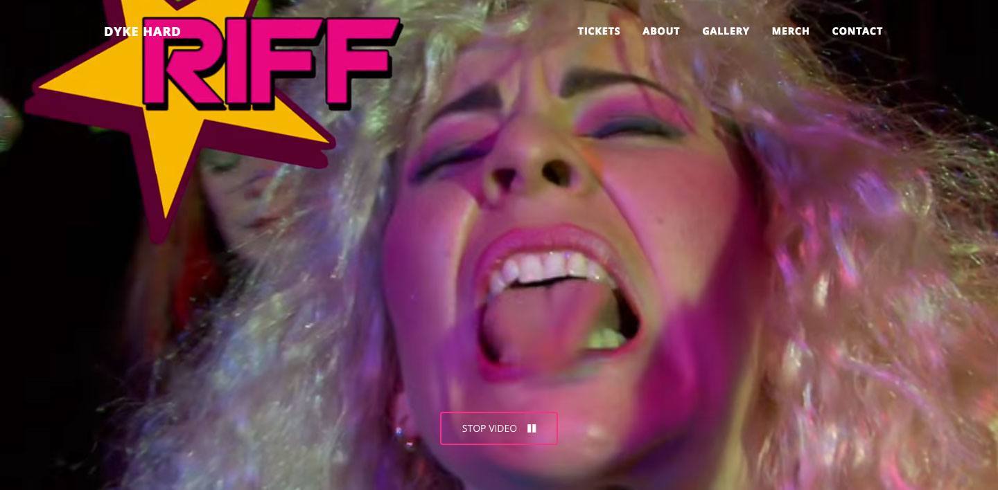
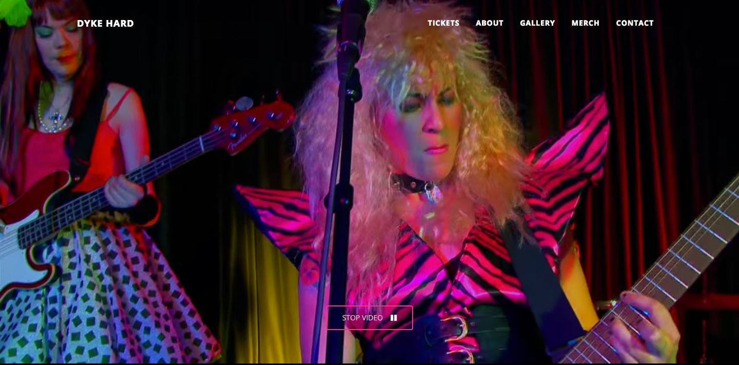
Dyke Hard

Let us return to the world of movies. Konstfack in Sweden is currently in its third year of organizing a master’s degree program that focuses on norm criticism, as led by Johanna Lewengaard and Joanna Rubin Dranger. The same program was previously known as “Storytelling” and was already at the time underpinned by some of the same ideas concerning challenging normative and discriminatory hierarchies.

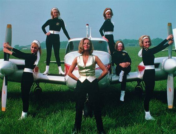
One of the results of the Storytelling program was the film Dyke Hard (2014), a celebration of the norm-critical discourse in the style of John Waters. The airplanes have been replaced by motorbikes, the women are no longer only white and dressed in tight-fitting clothes—and they don’t take orders from a white, middle-aged man, as in Goldfinger. “Just get on the bike, dyke!” one of the characters yells to another from the back of a motorbike.

The message here is steeped with feminist ideas, from action and plot to portrayal. It includes the designer’s role as communicator, author, and enabler alike. And it demolishes the heteronormative not only with content but with form.